Why this exists
I started Body Electric in 2019 as a way to learn product design by doing it – not as a class assignment, but as something real, with users I didn't know, who could leave at any time. Five years later, it's still running, currently as Evectric Productions: a venue-based experience where staff produce themed events, models walk runways for points, and a tiered hierarchy of roles gives everyone a path to progress.
Continuity is the part I value most. Coursework can teach methods; only a live product teaches you what happens when a design decision meets ten thousand strangers and half of them disagree with you.
Five years of A/B testing on a live audience taught me more about microcopy, friction, and feature adoption than any course could. What this project actually trained
How I work on it
The loop is simple and ruthless: ship, observe, iterate. I watch players in real time. I read feedback channels. I instrument what I can and ask what I can't. Then I change one thing – never two at once if I can help it – and watch what happens.
- Observational research – sitting in sessions, watching where players hesitate, where they bail, where they look surprised
- Feedback loops – community reports, in-experience prompts, direct messages
- A/B variants – button placement, scroll behaviour, label copy, animated affordances. Most lifts come from microcopy and placement, not from features.
This is the part of design coursework that usually leaves out: products have weather. They drift. A button that worked last year stops working when the population changes, when a new platform feature lands, when fashion in the broader Roblox ecosystem shifts. You don't ship and walk away. You tend.
Selected systems
Implementation has grown increasingly AI-assisted since 2023 – directing tools like Claude to build and iterate on the systems below (Asset Manager, Point system, Bot Manager) based on observed user behaviour and my own design decisions. The design calls stay mine; the AI moves the code faster from observation to shipped change.
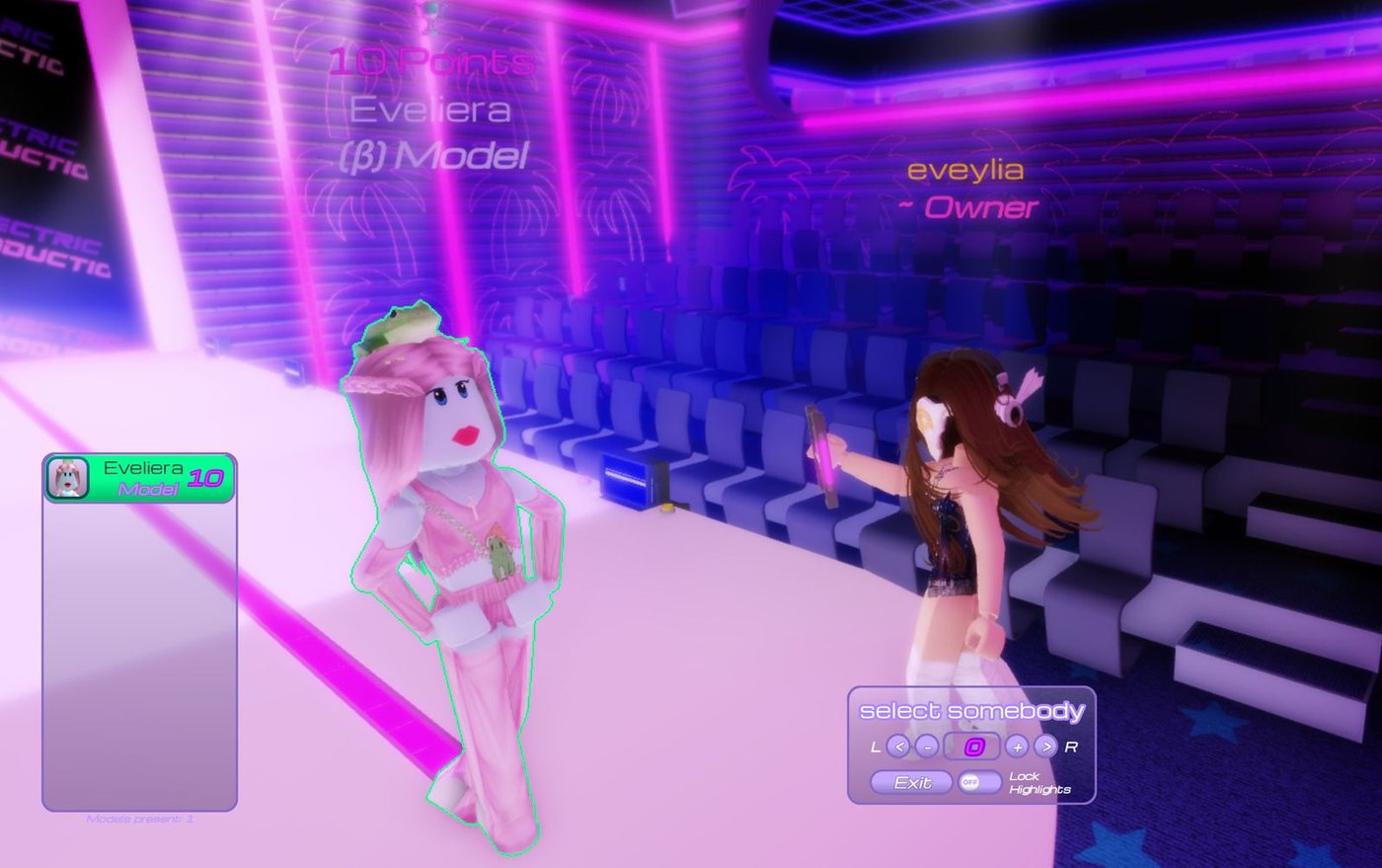
Role-tier progression & point system
The economy is built on roles and recognition. Players enter as Audience, can apply to be Models or Interns, and earn their way up through Allstar, Elite, and Staff. The progression is visible: every player sees what tier they sit on, who's above them, and how to get further up.
Points are the bridge between performance and progression. Staff award points to performers in-experience using a deliberate, one-at-a-time interface – selecting the player, naming the action, committing the points. The friction is intentional: if awarding points were too easy, the value of the points would collapse.
Modular customisation UI
The customisation system is where most users spend their time. Every wearable can be tuned across multiple dimensions – material library, RGB colour, transparency, reflectance, decal IDs, type variants – and the UI has to make that surface tractable without overwhelming first-time users.
Early versions failed the new-user test. The redesign introduced clear visual hierarchy, side-by-side preview, and a default starting kit that gave new players something coherent within five seconds of arrival. Apply / Remove buttons sit on a single vertical axis with L/R input indicators so the same flow works on PC and console.
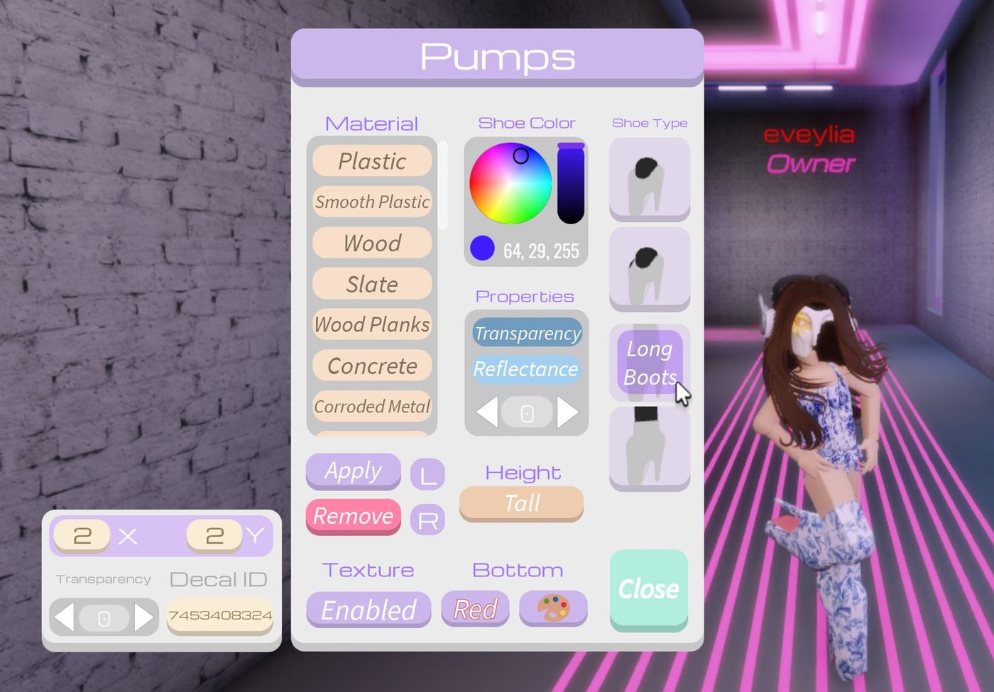
The most consequential change wasn't a feature – it was the decision to surface the exact RGB value (64, 29, 255 in this capture) alongside the colour wheel. Users with specific brand palettes were trying to match colours by eye and quitting in frustration. Surfacing the numeric value let them paste from external tools and trust what they were getting.
Asset manager
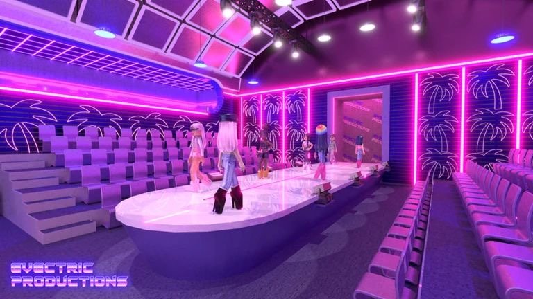
Staff need to swap entire venue themes – a Halloween layout one week, a "Red Fall" decor set the next, a "Fiji" beach build for summer. Without an asset manager, every theme change is a manual rebuild. With one, it's a few clicks.
The technical layer is built on Roblox's Data Storage; the design challenge was making destructive actions safe. Early versions let staff accidentally overwrite collections. The current version has explicit Override / Clear / Lock controls, displays asset counts and last-edit dates so staff can see what they're touching, and shows the editor's name on each entry for accountability across a team.
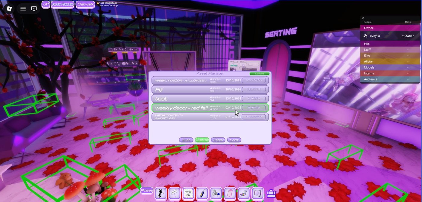
The visible structure – name, asset count, date, contributor – does most of the work. Anyone can see, in one glance, what they're about to swap into the venue and who last touched it. Mistakes get harder; recovery gets faster.
What I learned about live products
- Design is never finished. Even good decisions need re-litigation when the population changes.
- Microcopy outperforms features. The largest measurable lifts came from copy and placement changes, not new functionality.
- Watch what people do, not what they say. Self-report is unreliable; behaviour isn't.
- Friction has compounding interest. A 1% drop-off at every step kills a five-step flow. Audit relentlessly.
- Affordance is everything. If a player can't tell something is interactive within a glance, it isn't.
- Make destructive actions visible and reversible. The Asset Manager's "you are about to override" pattern saved more weekends than any individual feature ever did.
What I'd do differently
I'd instrument earlier. The first three years ran mostly on intuition and observation; structured event tracking only came later, and several decisions from that era I now suspect were wrong. Build the measurement layer before you need it, not after.
I'd also have written more down. Five years of design decisions live mostly in my head and in commit messages. A documented design system would have helped me – and helped anyone I might bring on later.
Why this matters for design roles
Operating a live product taught me that design is not a hand-off. It's a continuous conversation with users you'll never meet, conducted through the artefacts you ship. That mindset – instrumented, observed, iterated, never finished – is what I bring to applied design work, whether it's a circular-economy service, a digital product, or a sustainability-reporting interface.
The methodology I picked up at LAB taught me how to start a project. Body Electric taught me how to keep one alive.