The brief
The brief came from MAKE – an EU-funded regional project in Päijät-Häme working on circular-economy solutions for businesses. The target group was specific: families with children in Lahti, the people whose buying habits would do the most to keep small local businesses alive.
The first weeks of the studio were spent trying to understand those families on their own terms – not as an abstract audience, but as people whose Tuesday-evening grocery decisions shape what the city looks like five years out.
The problem we found
Two findings from interviews and the survey converged into the centre of the project:
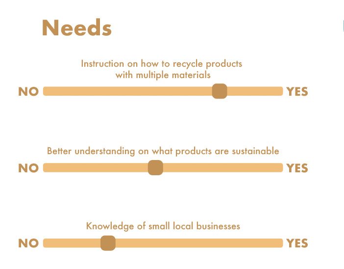
- Most locals can't name local businesses. Even residents who actively wanted to support small Lahti businesses struggled to recall more than a handful. The local economy was, in the most literal sense, invisible.
- People want to act more sustainably but have no source they trust. Sustainability claims came from every direction – packaging, signage, ads – but residents had no neutral way to tell which were substantive.
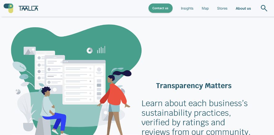
Together these reframed the project. The deliverable wasn't a directory; it was a trust mechanism. Something that could compress an honest sustainability claim into a form residents could act on in seconds, while still backing it up for anyone who wanted to dig.
Research
Background research split into two tracks: understanding the users, and understanding the rating systems that already existed in the world.
User research
Semi-structured interviews with local parents formed the qualitative spine. We paired this with a survey for residents who couldn't sit for an interview. From the raw data we built three personas representing varying commitments to sustainability and different lifestyles – important because designing for the most committed user would have missed the people the brief was actually about.
We mapped behaviour three ways:
- Story maps – simulated scenarios where each persona interacted with the service
- User journey maps – traced a first-time visitor's emotional arc, marking improvement areas
- Stakeholder maps – visualised the relationships between residents, businesses, and the regional ecosystem
Benchmarking
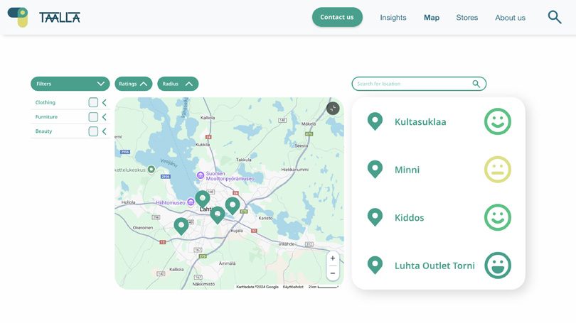
Two existing services anchored the comparison: Good On You, the global fashion sustainability rating platform, and Salpakierto, Lahti's regional waste-management service. Good On You contributed the idea that a rating could be both simple at the surface and detailed when inspected. Salpakierto contributed the regional context – multilingual content, a map-first interface, and a reminder not to duplicate what was already covered.
Standards
We studied the European Sustainability Reporting Standards (ESRS) – part of the EU's Corporate Sustainability Reporting Directive – to ground our rating dimensions in something defensible. Environmental, social, and governance pillars from ESRS shaped what our rating would and wouldn't try to measure.
How might we
From the research we framed the design space as a set of How-Might-We questions. Two carried most of the weight:
How might we provide families with reliable information on the sustainability of products?
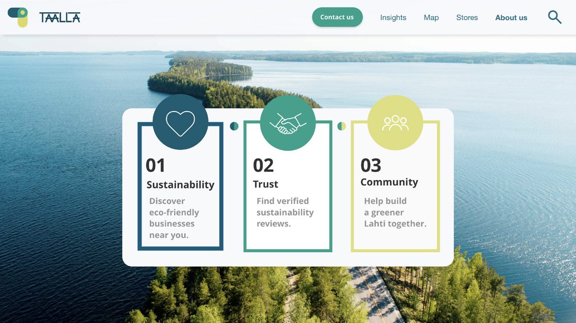
How might we help local businesses to be more seen by customers? The two questions that anchored every later decision
Both had to be answered by the same artefact. A service that helped consumers without helping businesses would have starved the supply side; one that helped businesses without helping consumers would have been just another directory.
The first prototype
The first prototype was built in Squarespace – fast, rough, deliberately low-fidelity. Its job was to give us something physical to point at while we argued about layout, hierarchy, and tone. The features list crystallised in this phase:
- Homepage with clear value proposition
- Location and item search
- Featured stores · Stores nearby
- Sustainability rating and description
- Categories
- About us
Time and tooling forced us to cut. We focused on the homepage hierarchy, the rating system, and the map view – the three surfaces a first-time user would touch in their first thirty seconds.
Designing the rating – and rethinking it
This is the part of the project I'm proudest of, because what we shipped was not what we started with.
v1 – percentage-based
The first rating system used percentages. It was precise, it was defensible, it mapped cleanly to ESRS-style scoring. We thought we were being honest. Testing said otherwise:
- Percentages read as overly technical – users associated them with audits and reports, not decisions
- Users wanted a simpler, more intuitive visual that didn't demand mental effort to parse
- Numerical precision invited dispute – a business at 73% would argue for 78%, and the conversation about the underlying claim got lost
v2 – five-level smiley scale
We pivoted to a five-level scale built around faces, anchored explicitly to Good On You's precedent of using a small, glanceable mark. The five levels:
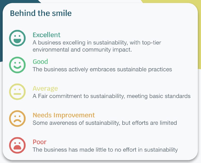

The decision wasn't just aesthetic. The smiley scale solved three problems at once:
- Comprehension – readable in under three seconds, no training required
- Stakeholder communication – business owners could understand and discuss where their rating sat without statistical literacy
- Honest abstraction – five buckets reflect the resolution our methodology actually supports; percentages implied precision we didn't have
Each face is paired with a short written description ("A business excelling in sustainability, with top-tier environmental and community impact") for people who want the context behind the rating.
The three rating dimensions
Underneath the smiley scale sit three measured dimensions – drawn from ESRS but compressed into language a non-specialist could read:
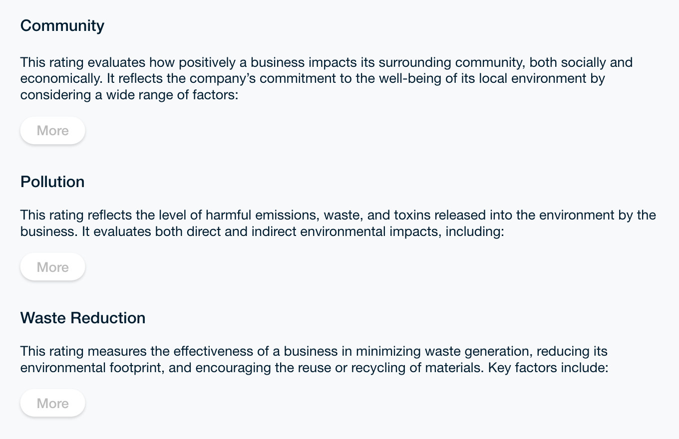
- Community – how positively a business impacts its surrounding community, socially and economically
- Pollution – the level of harmful emissions, waste, and toxins released into the environment
- Waste Reduction – the effectiveness of the business in minimising waste, reducing its footprint, and encouraging reuse or recycling
Each dimension has its own page with a "More" affordance for users who want the methodology. The composite smiley is the surface; the breakdown is one tap away.
The Adobe XD prototype
The second prototype was rebuilt in Adobe XD with light coding for genuine interactivity – a working navigation system, a demonstrable search, and hover states on the rating elements. Several screens emerged as core surfaces:
Testing & what changed
We tested with two cohorts: classmates from outside the project who came in cold, and students from other departments who were closer to the brief but not part of the team. The teaching staff stress-tested the final round.
Three problems came up consistently:
- Poor button placement – buttons sat in inconvenient locations, slowing navigation and frustrating users mid-flow
- Ambiguous homepage messaging – first-time users couldn't tell within ten seconds what the service was for
- Unclear scrollable areas – users assumed content was static when it wasn't, missing entire sections
The fixes:
- Buttons repositioned to more intuitive locations along a consistent vertical axis
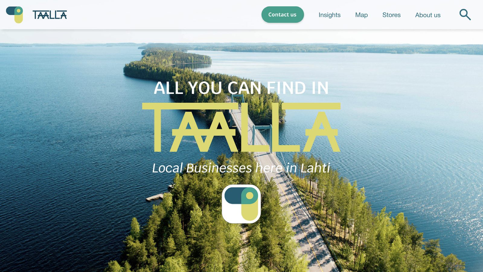
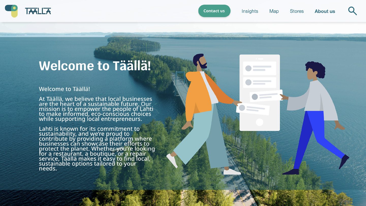
- Homepage redesigned with stronger, more declarative messaging – "All You Can Find In Täällä" and a clearer mission paragraph
- Visual cues (arrows, subtle indicators) added wherever scrollable content was hidden below the fold
- And – the headline change – the percentage-based rating replaced with the smiley scale
Outcomes
per rating decision
communicable mark
into a single face
The final concept service was presented to MAKE in December 2024. The piece I'm most attached to wasn't the homepage or the map view – it was the rating legend. It's the artefact that survived translation between residents and businesses, between us and anyone who might pick the project up next.
Reflection
What worked
Treating the rating framework as a first-class deliverable, not a UI detail. Most of our learning compounded into that artefact. Cutting from percentage precision to a five-bucket scale felt like a loss in the moment and was actually a gain – fewer dimensions, more honest abstraction.
What I'd do differently
Test the rating with business owners earlier. We tested with residents from week three onwards but didn't get business owners reacting to the framework until much later. Their feedback was the most consequential and the hardest to incorporate when it finally came.
What I'd test next
Whether the rating model survives translation across cultural contexts. "Sustainable" means different things in Lahti versus, say, Riga or Dublin. The methodology page can hold depth, but does the glanceable smiley survive cross-cultural transfer without losing its honesty? An open question worth a follow-up study, and one that would interest any organisation working on circular-economy services beyond a single region.
What this taught me
That communicating sustainability is, at heart, an information design problem. The science is the easy part. The hard part is compressing a complicated, contested claim into a form that survives a three-second glance without losing its meaning. Every project I've worked on since has come back to that lesson.