
The brief
Build a single-frame story from real data on orbital debris. Audience: people who have heard of space junk but couldn't tell you what's really up there, where it sits, how it got there, or why it matters. The format constraint was unforgiving – one frame, no scrolling, no animation, no toggles. Whatever the reader took away had to land in the first ten seconds.
The deeper challenge was honesty. Space-debris data is messy: catalogues disagree, fragments under 10cm aren't reliably tracked, attribution to source country is politically loaded. A clear graphic that hides those caveats would be misleading. The work had to be clear and self-aware at the same time.
The data
Two sources anchored the project: the European Space Agency's public materials on space surveillance, and Jonathan McDowell's General Catalogue of Artificial Space Objects (GCAT) – 24,886 launch records, openly published.
Each record was classified into one of two buckets:
- Payload – satellites, probes, station modules
- Other – rocket stages, adapters, debris, non-functional or failed payloads
That single classification did most of the heavy lifting later. The story isn't "we launched a lot"; it's "the share of useful material in what we launch has shifted, and the share of debris is compounding."
Narrative arc – ASK / EXPLORE / DISTILL / TELL
The figures don't sit on the poster in arbitrary order. They follow the data-storytelling arc taught in Data Studio: open with a question, give the reader room to look, surface the insight, deliver the consequence.
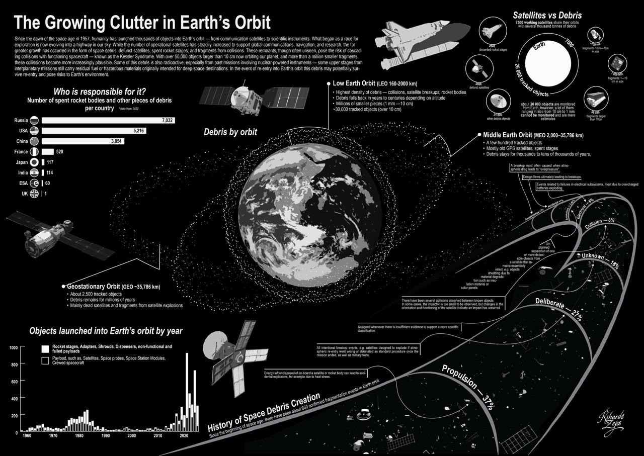
ASK – Who is responsible?
Figure 1 opens the poster. A horizontal bar chart of spent rocket bodies and debris pieces by country. Russia leads with 7,032; USA at 5,216; China at 3,854. France follows with just 520. The visual gap between the top three and everyone else is the rhetorical opening – most readers don't expect the scale.
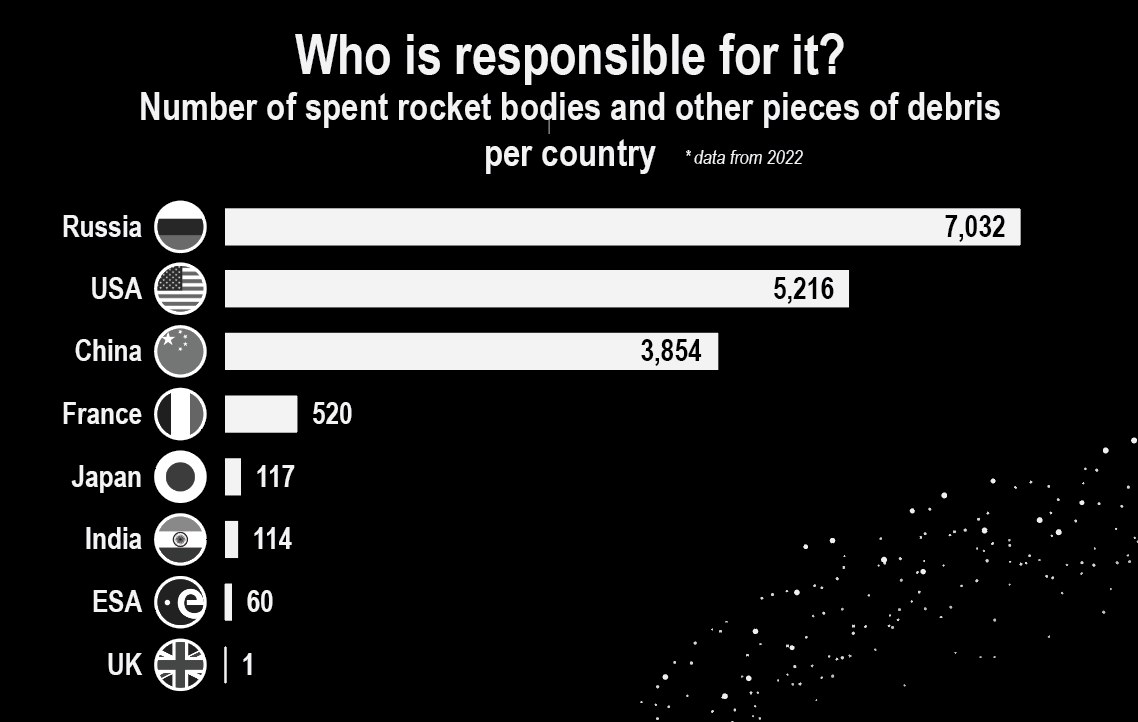
EXPLORE – What's actually up there?
Figures 2 and 3 give the reader room to look. Figure 2 uses size-encoded markers to compare working satellites (7,500) with debris of various scales – 2,800 defunct satellites, 21,000 other debris objects, 36,500 fragments larger than 10cm, a million fragments at 1–10cm, an estimated 130 million fragments at 1mm–1cm. The size of each marker carries the order-of-magnitude story; exact counts sit next to them.
Figure 3 maps the debris to the three orbital zones. Low Earth Orbit (LEO, 160–2000 km) carries the highest density. Middle Earth Orbit (MEO, 2,000–35,786 km) holds GPS satellites and old stages. Geostationary Orbit (GEO, ~35,786 km) has about 2,500 tracked objects and debris that will stay for millions of years.

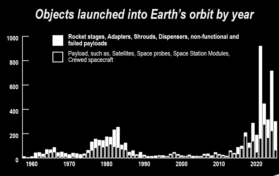
DISTILL – What changed?
Figure 4 is the chart that ends the conversation. Annual launches from 1958 to 2025, stacked: payload in one shade, everything else in another. The shape is calm and almost flat through the 1990s and 2000s, then becomes vertical around 2018. The mega-constellation era – Starlink and its peers – is the entire post-2018 silhouette. No caption needed.
TELL – What does this mean?
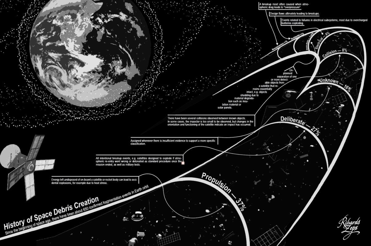
Figure 5 closes with the causes. A timeline of major fragmentation events, broken down by cause: Propulsion 37%, Deliberate 27%, Unknown 16%, Collision 8%, plus smaller categories. The deliberate slice is the uncomfortable one – those are intentional breakups, mostly military tests.
Design decisions
Palette – restraint as honesty
The whole poster is white and gray-scale on black. No colour. The constraint was deliberate: colour in a debris graphic would imply categories where the data resists categorisation. Greyscale lets the position and size of every mark do the talking, which is what the visual-variables hierarchy says is most precise anyway.
Visual-variables hierarchy
Following Koponen & Hildén, the most precise encodings are position and length; colour hue is less precise and easier to misread. The poster leans on position (years on the x-axis, bar heights on the y-axis) and length (the bar chart of country responsibility). Marker size is used only for the satellites-vs-debris overlap, where the impression of relative scale matters more than exact counts.
Data-ink ratio
Tufte's principle: maximise the ratio of data-ink to non-data-ink. The poster has no chart borders, no shading, no 3D effects. The only gridlines are subtle dashed guides on the y-axis of Figure 4. The Earth diagram has no atmosphere glow, no decorative stars beyond the actual debris markers. Above all else, show the data.
Typography
Arial Narrow across the whole poster – 40–55pt for body text, 70–100pt for headings. The condensed proportions let dense annotation sit close to the figures without the text breaking apart at large print sizes. Italic is used sparingly to mark figure titles (Satellites vs Debris, Debris by orbit).
What I cut
- Six debris-cause categories collapsed to four with annotation
- A separate timeline bar removed in favour of the single annual-launch chart
- Per-country breakdown of debris-by-orbit moved to a footnote rather than a fourth main figure
- Original colour palette (terra-cotta highlights on cream) abandoned for black-and-white once it became clear colour was implying claims the data didn't support
DIKW – turning data into a call to act
The DIKW pyramid (Data → Information → Knowledge → Wisdom) maps cleanly onto the project:
- Data – 24,886 raw launch records from GCAT
- Information – the five figures, each surfacing one pattern in the data
- Knowledge – the design rationale (palette, scale, encoding) that makes the patterns legible
- Wisdom – the conclusion: international debris-mitigation standards and sustainable launch practices are not optional
Most data visualisations stop at information. The point of teaching DIKW alongside ASK–EXPLORE–DISTILL–TELL was to push past the figures to a defensible so what.
Key insights
Post-2015 mega-constellation deployments – Starlink and its peers – have driven payload counts to record highs. The "Other" category, meanwhile, is accelerating. The compounding hazard isn't in the satellites we use; it's in the stages and fragments we leave behind. Headline finding from Figures 4 & 5
- Payload surge. The shape of Figure 4 changes around 2015. Annual launches go from steady to vertical, almost entirely driven by mega-constellation deployments.
- Hazard accumulation. The Other bars track payloads with a delay – every constellation leaves its supporting hardware in orbit.
- Monitoring gap. Of roughly 26,000 tracked objects, the figures that aren't tracked (under 10cm) outnumber those that are by orders of magnitude.
- Cause distribution. 37% of fragmentation events trace to propulsion-related failures; 27% are deliberate breakups (mostly military tests). The problem isn't only inattention – some of it is policy.
Reflection
What worked
Locking the palette to black-and-white early. The constraint forced every encoding decision to defend itself. Anything that wouldn't survive without colour got cut – which usually meant it shouldn't have been there.
What I'd do differently
Show the monitoring gap more directly. Figure 2 hints at it (size-encoded markers, "cannot be monitored" callout), but the gap between tracked and actually-up-there is the most important uncertainty in the dataset, and it deserves its own figure rather than a side note.
What I'd test next
A printed version at A0 in a public setting (a museum lobby, a science centre) to see whether the narrative arc still lands when the reader has thirty seconds rather than three minutes. Posters that work on screen often fall apart at print scale; the inverse is also true. Worth verifying.
What this taught me
That information design is mostly about subtraction. Every visual element competes for attention. Making one element strong means making others quieter – not because clutter is bad in principle, but because the reader's first three seconds are finite. This lesson carried directly into the Täällä rating system, where the same logic applies to interface hierarchy.