The problem
Dublin has a dense and varied cultural life. For students – especially international and Erasmus students arriving with no established networks – navigating it is harder than it looks. The city has no central, student-focused cultural guide. Information is scattered across Instagram, university noticeboards, peer recommendations, and occasional Google searches. Participation is largely driven by chance.
My initial assumption was that students felt culturally excluded – that events were pitched at tourists rather than residents. The survey disproved this. What students described was something subtler: not exclusion, but fragmentation. They were not under-served. They were under-oriented.
Students are surrounded by cultural opportunities, but they lack a simple and trustworthy structure that helps them navigate these opportunities with intention. Problem definition, developed after survey synthesis
Research
The primary research method was a student-centred survey built in Typeform. Before writing a single question I went back to first principles – following the guidance in This Is Service Design Doing (Stickdorn et al., 2018), which argues that early research must represent the real conditions of users as closely as possible rather than confirming assumptions. The analysis process involved grouping responses into themes, following what TISDD describes as building the research wall – arranging information visually to reveal patterns not visible through isolated reading.
The survey covered six areas: cultural attendance frequency, preferred event types, discovery channels, barriers to participation, attitudes toward affordability and atmosphere, and preferences for future guides. Questions balanced quantitative structure with open responses and used logic branching to capture additional context. Respondents included Irish, Erasmus, and international students.
The findings rearranged my assumptions entirely. Cultural discovery is peer-driven and algorithmic – friends, Instagram, TikTok, and university societies are the dominant channels. Institutional or official sources barely register. The barriers students described were consistent: cost, unfamiliar neighbourhoods, time, and simply not knowing what is happening. Affordability was described as important or extremely important by a large majority.
What students valued in cultural experiences was authenticity – but defined through locality and informality, not through opposition to tourism. Community-based, creatively independent events were described as more meaningful than polished institutional programming.
Synthesis and direction
Synthesis followed the Double Diamond model – first expanding understanding through research, then narrowing into a clear direction. Findings were clustered into themes: discovery, trust, barriers, emotional value, and accessibility. The pattern that emerged pointed consistently toward one issue: clarity of orientation, not availability of information.
This led to the How Might We statement that anchored the design phase:
How might we help students in Dublin discover affordable, authentic and relevant cultural experiences in a lower-effort way? HMW statement, Define stage
The statement deliberately avoided adding more data as a solution. Students do not need more information – they need a clearer structure for the information that already exists.
Design decisions
Colour
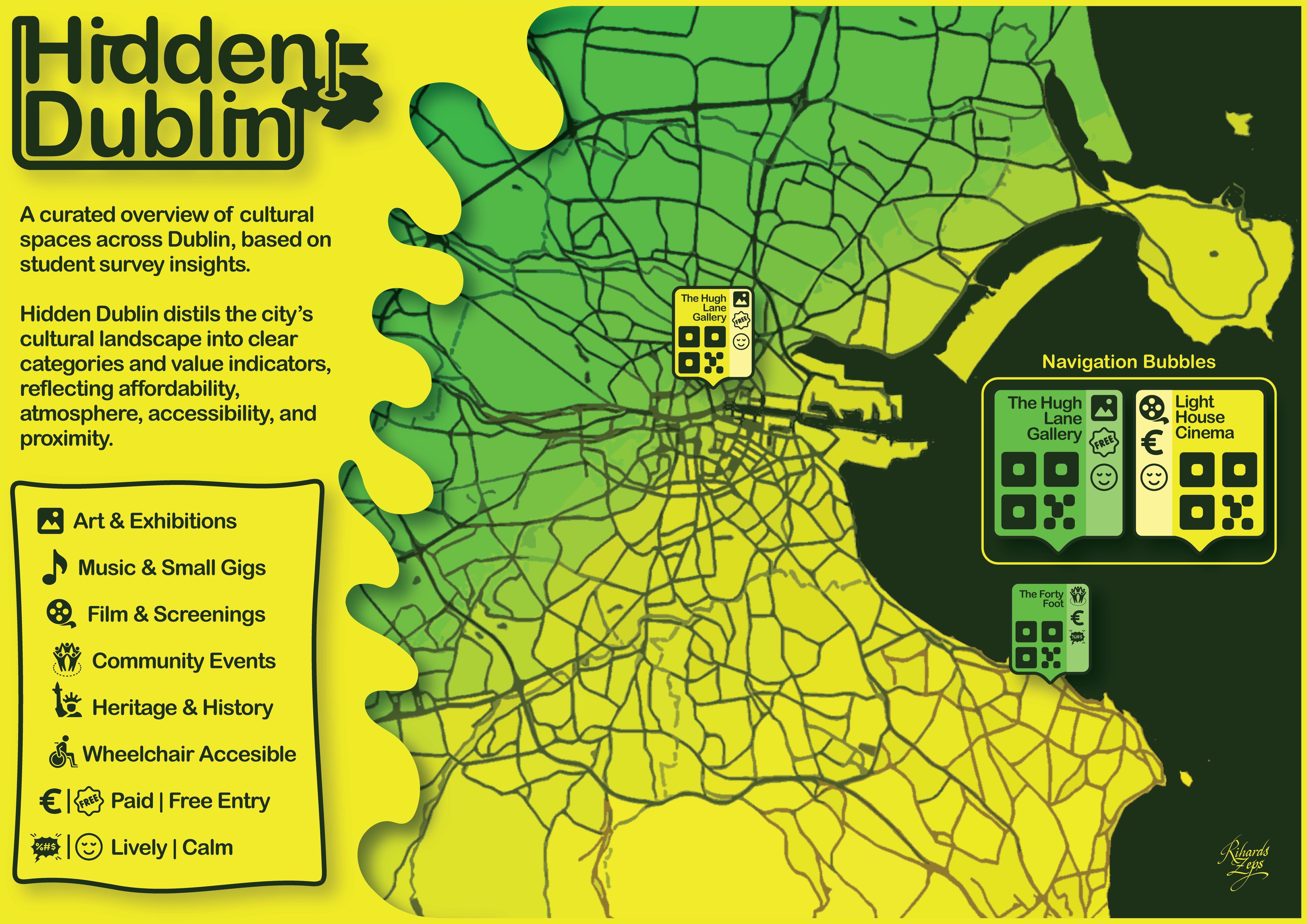
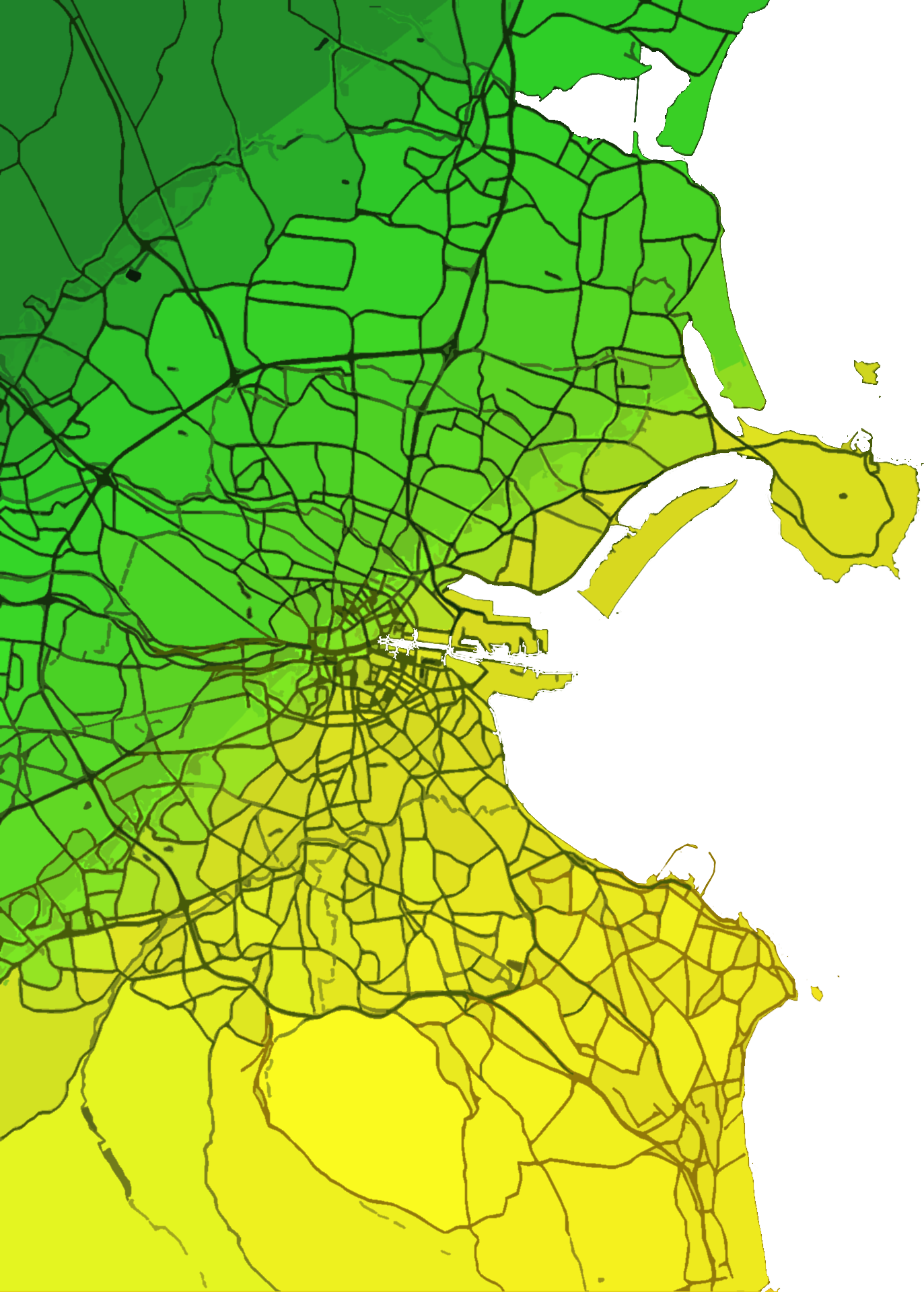
The palette – moss green and bright yellow – was drawn directly from Dublin’s city buses. The choice was intentional at multiple levels. It creates an immediate visual association with Dublin for anyone who lives here. It is warm without being generic. And it communicates approachability rather than authority – which matters when the audience is students navigating an unfamiliar city.
The colour psychology was also grounded in the module’s visual communication theory and Norman’s framework on visceral and reflective experience – the idea that design shapes how an environment is interpreted and remembered before any conscious reading takes place. Green communicates nature, calm, and accessibility at a visceral level. Yellow signals attention and energy without aggression. Together they suggest something discoverable rather than official – the palette positions Hidden Dublin as an invitation rather than an institution.
Daniel Pink’s argument on abundance is also relevant here: in a world where basic access is no longer the primary differentiator, people seek belonging, meaning, and emotional resonance. Students do not attend cultural events purely for content – they attend for atmosphere, discovery, and a sense of place. The colour system was designed to evoke exactly that register.
Typography
Arial Rounded MT Bold was chosen for its friendly, contemporary appearance. Rounded letterforms echo the circular icons and bubble shapes used throughout the map. There are no sharp edges anywhere in the composition – not in the type, not in the icons, not in the legend frame. This was a deliberate visual communication decision: the map should feel like an invitation, not a signboard.
Information architecture
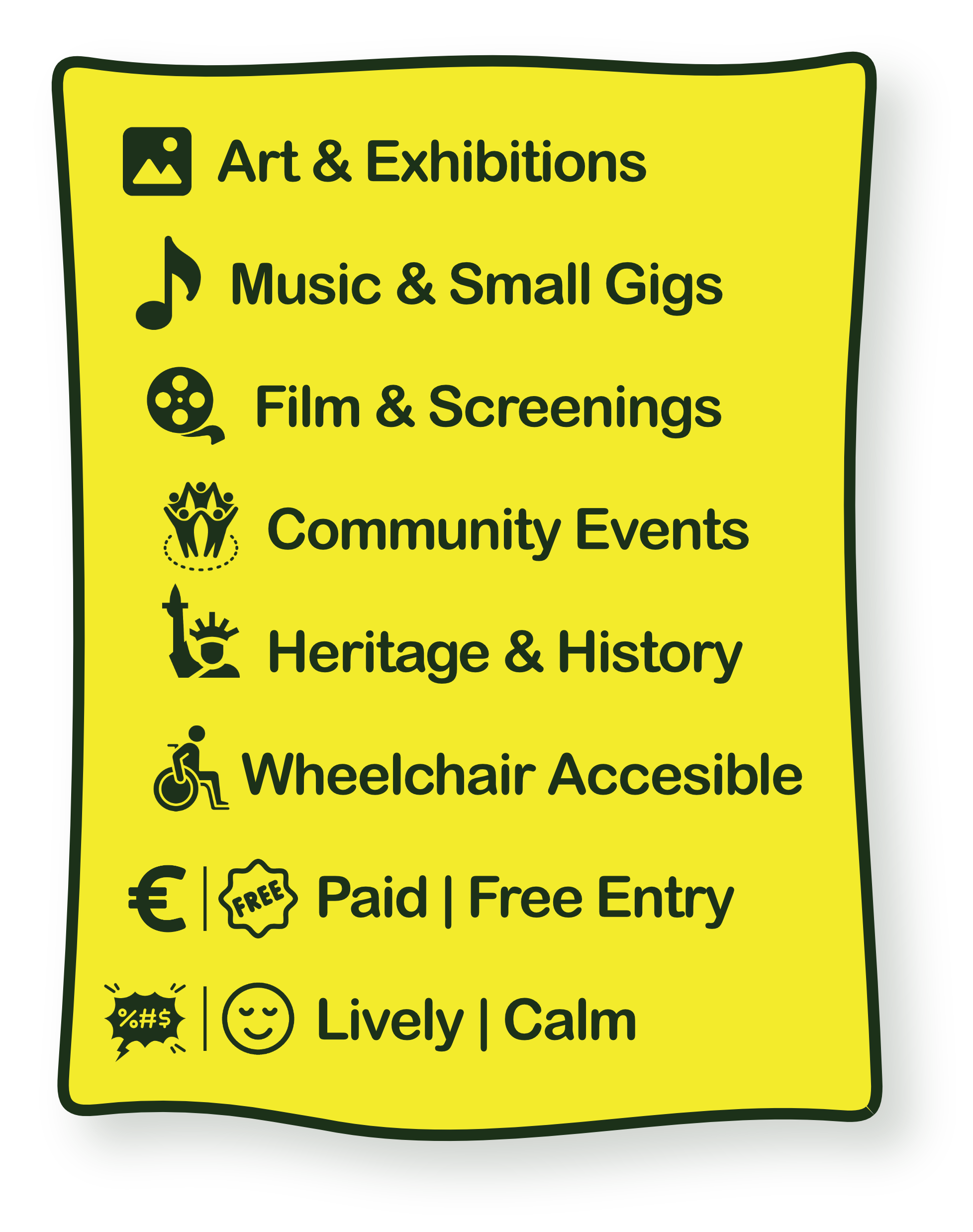
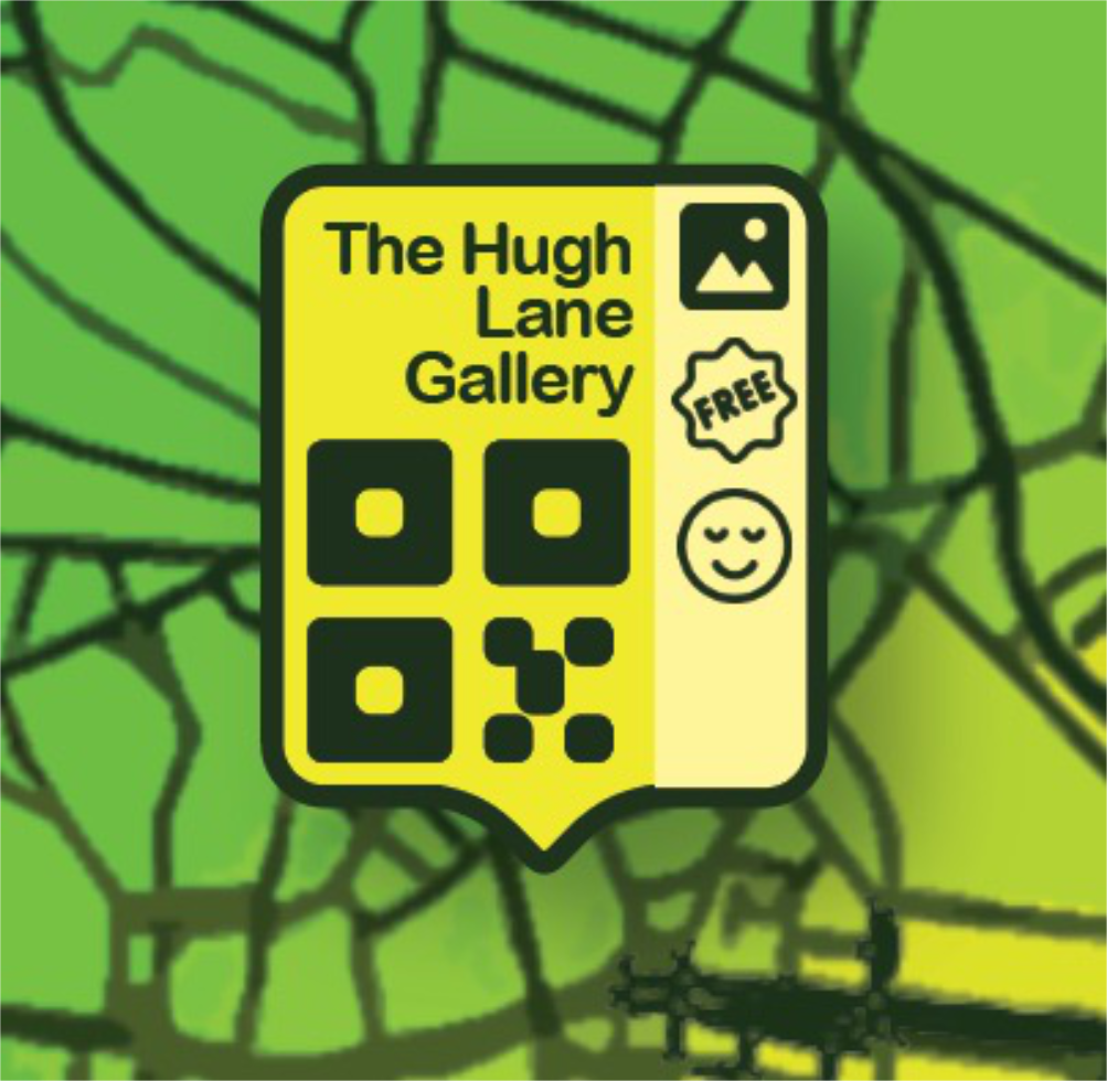
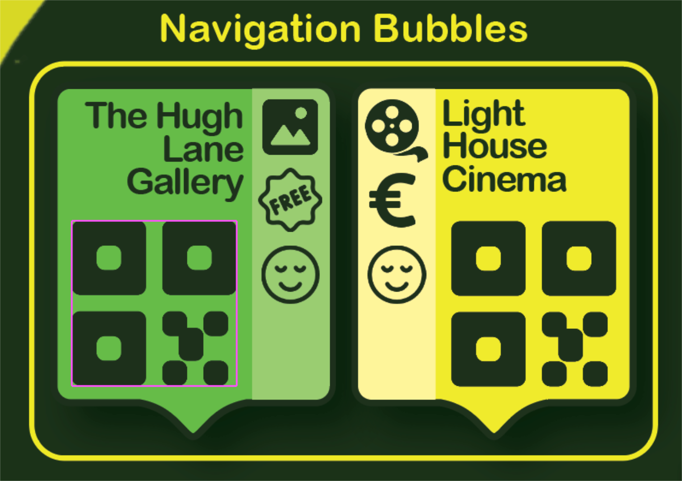
The legend organises venues into six categories drawn from the survey’s most frequent responses: Art & Exhibitions, Music & Small Gigs, Film & Screenings, Community Events, Heritage & History, and Wheelchair Accessible. Value indicators – paid vs free entry, lively vs calm atmosphere – are built into each location bubble, reflecting the affordability and atmosphere concerns that dominated the research.
Each location on the map is represented by a navigation bubble that combines the venue name, its category icon, a price indicator (free or paid), an atmosphere indicator (lively or calm), and a QR code for direct access. The bubble system packs five pieces of information into a format a student can read in under two seconds.
The foldable concept
The original brief explored a foldable physical map – a format that would make the guide tangible and distributable at universities and cultural venues. The static poster represents the visual concept and information architecture of that idea, but the bubble system was always conceived with an interactive version in mind.
The intended behaviour for a digital Hidden Dublin is directly analogous to how Google Maps works when you search for a category of place: as a user zooms into the map, navigation bubbles appear at each cultural location, revealing the venue name, category, price, atmosphere indicator, and QR code at the appropriate scale. At city level, the map reads cleanly as an overview. As the user zooms in, the detail emerges – exactly when and where it becomes useful, and not before. This is a fundamentally different experience from a static legend, and it is the experience Hidden Dublin was designed for.
This distinction matters because it reframes the dedicated bubble panel on the poster. It is not a compromise or a workaround for the limitations of print – it is a demonstration of the system. The panel shows two bubbles side by side to communicate how the full interactive version would behave: what information each location surfaces, how the icons and indicators work together, and what a student would see when they zoom into a neighbourhood they want to explore. The static format clarified exactly what an interactive version would need to deliver, and the bubble panel is the proof of concept for that interaction.
Reflection
What worked
Treating the survey as the actual design brief rather than a formality before the “real” work began. The reframe from exclusion to orientation only happened because I was willing to let the data overturn my starting assumption. If I had sketched the map first and surveyed second, I would have designed a solution to the wrong problem.
What I'd do differently
Test the legend and the bubble system with students before finalising the layout, not after. The categories and value indicators are derived from survey data, but nobody outside my own judgement reviewed whether the icon-and-colour system was actually legible at a glance to someone seeing it for the first time. Täällä taught me that lesson properly through testing rounds; Hidden Dublin still owes itself that step.
What I'd test next
The interactive zoom behaviour described above is currently a design intention, not a tested one. The next stage would be a working prototype – even a rough Figma click-through – to verify that the zoom-reveal pattern actually reduces cognitive load the way Google Maps' equivalent does, rather than just looking right in theory. Expanding the cultural dataset beyond the three demonstration venues would be the second step, testing whether the category system holds up once Dublin's full cultural breadth is mapped onto it.
What this taught me
That cultural participation is shaped by perception and trust as much as by the existence of information. Dublin already had everything Hidden Dublin maps – the events, the venues, the prices – but none of it was structured in a way students could act on with confidence. That distinction, between information existing and information being usable, is the same lesson Täällä taught me about sustainability ratings: the data is rarely the hard part.
Why this matters for design roles
Hidden Dublin is the smallest project in this portfolio, but it taught me something the larger ones didn't have room to isolate as cleanly: the value of letting research overturn your first idea before you've invested anything in building it. That habit – survey first, sketch second, never the other way round – is the one constant across everything else here, whether the deliverable is a sustainability rating, a live product system, or a single-frame poster.